Merkidentiteit
De beste kleur bij jouw positionering en merkidentiteit bepalen
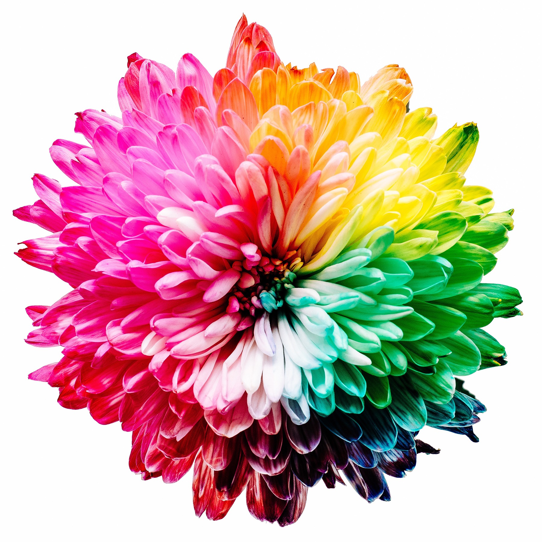
Heb jij je weleens afgevraagd waarom zoveel grote bedrijven een blauw logo hebben? Zo’n 90% van impulsaankopen wordt enkel bepaald door kleur (bron). Als je nu jouw schouders ophaalt omdat jouw B2B product of dienst niet zo vluchtig is sla je de plank mis. Ook als het aankoopproces langer duurt heeft kleur een enorme invloed (bron) op de besluitvorming. Kleur is namelijk in belangrijke mate bepalend voor ons oordeel over een merk. Welk effect heeft de kleur van jullie merk?
Kleur in positionering en merkidentiteit bepalen
Onderstaand model is een prettige leidraad voor een gesprek over kleuren in relatie tot merkidentiteit en positionering.
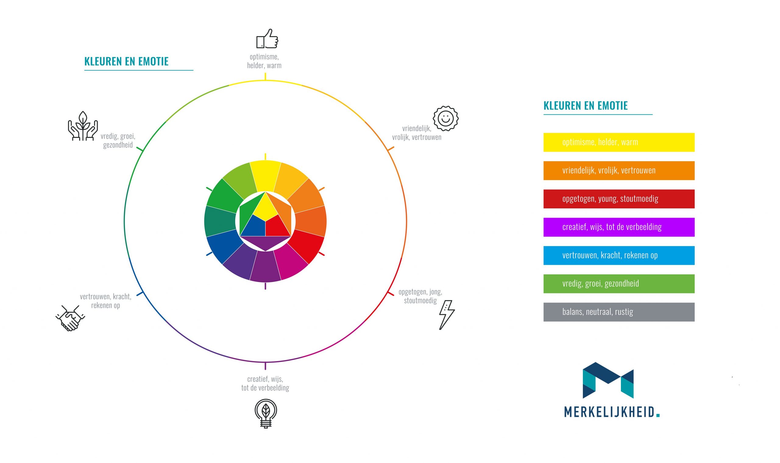
Kleuren en emotieschijf helpt jou de best passende kleur bij jouw positionering en merkidentiteit bepalen. Klik op het plaatje om het hoge-resolutiebestand te downloaden.
Op het gebied van positioneren en merkidentiteit zijn de belangrijkste overwegingen voor het kiezen van een kleur:
- Kleurgebruik van de belangrijkste concurrenten
- Positioneringsconcept / gewenst merkarchetype
Gevolgen van kleurgebruik door concurrenten
Kleuren roepen gevoelens op. Het is dan ook niet toevallig dat in veel markten de gevestigde marktleider veel blauw gebruikt. Blauw staat immers voor vertrouwen, kracht en betrouwbaarheid.
Ook in deze markt heb je dus een purple cow nodig.
In deze markt is het als nieuwkomer of nieuw merk onverstandig om óók voor blauw als belangrijkste kleur te kiezen. Waarom? Jouw belangrijkste concurrenten hebben jaren de tijd gehad om hun merk te koppelen aan deze kleur. Jouw ook-blauwe merk wordt op zijn hoogst gezien als een variant op hetzelfde, en waarom zou je dan wisselen?
In veel gevallen zal de beste beslissing zijn om bewust ver afstand te nemen (je duidelijk anders te positioneren) van de kleuren van jouw belangrijkste concurrenten.
Merkidentiteit en positionering versterken elkaar
Ons merk moet niet alleen opvallen, het moet ook een voorkeurspositie in het brein van de afnemer krijgen. Hoe zorgen we ervoor dat onze merkidentiteit en positionering elkaar versterken?
Onderzoek wijst uit dat mensen een voorkeur hebben voor een merk waarvan het merk en de gekozen kleur bij elkaar passen. Het merk ING besloot een aantal jaren terug het roer om te gooien, het wilde de voorkeursbank voor Nederlanders worden. In moest een bank zijn die mensen in staat stelt om vooruit te gaan. De kleur oranje past niet alleen bij het Nederlandse maar ook bij de emotie die aan de kern van hun positionering staat. Mensen herkennen nu dat oranje past bij ING. ING krijgt tegenwoordig dan ook hogere cijfers dan grote concurrenten ABN en Rabo.
Kies dus voor een kleur waarvan de emoties aansluiten op het verhaal dat jullie als merk vertellen. Daar kan je onze schijf mooi voor gebruiken.
Voorbeelden van kleurgebruik in merkidentiteit
Per kleur bespreken we een of meerdere merken waar deze aan basis van de merkidentiteit staat en hoe deze kleur past bij de positionering.
Geel als belangrijkste kleur merkidentiteit
Geel communiceert optimisme en helderheid maar ook warmte. De gradatie geel is belangrijker dan andere kleuren, een lichtere variant communiceert een lage prijs waar een meer donkere variant eerder speelsheid bij zich draagt.
Een goed voorbeeld van dat laatste is het logo van Caterpillar:
![]()
![]()
Verhuurder Hertz kiest voor een lichtere geel in een vooral prijsgedreven markt:
![]()
Oranje als belangrijkste kleur merkidentiteit
Bij oranje associeren we termen als vriendelijk, vrolijk en vertrouwen. Speciaal voor Nederlanders komt daar natuurlijk ook een stuk nationalisme bij. Zoals we al eerder zeiden, een van de grootste Nederlandse banken, ING, claimt precies daarom de kleur oranje. Maar wat zijn andere merken die oranje centraal zetten in hun merkidentiteit?
![]()
De ‘Amazon-smile’ is uitgevoerd in oranje. De grootste internetwinkel wil vertrouwen inspireren, vertrouwen dat de consument voor alles bij ze aan kan kloppen. En met succes, oprichter Bezos is inmiddels en van de rijkste mensen op aarde.
![]()
Ook Harley Davidson kiest voor oranje bij een merk dat vrijheid centraal heeft staan. Bij het rebelse merk denken we aan de uitgestrekte Amerikaanse wegen en hoe het voelt om op een Harley richting de zonsondergang te rijden. Wie wordt daar nu niet vrolijk van?
Rood als belangrijkste kleur merkidentiteit
Rood staat voor opgetogen, jong en dapper. Het is niet lang zoeken naar een merk dat daarbij past, bij rood denkt namelijk bijna iedereen aan hetzelfde merk, Coca Cola:
![]()
Het merk is onverminderd positief en wil zich graag verbinden aan jonge mensen en de mooiste momenten in het leven. Of het nu kerst of de zomer is, Coca Cola is erij. De slogan was jarenlang ‘Always Coca Cola’ maar het bedrijf gaat met haar ervaringsgerichte positionering nog een stap verder.
Paars als belangrijkste kleur merkidentiteit
Paars wordt sterk geassocieerd met blauw en is natuurlijk al eeuwenlang een koninklijke kleur. Dat laatste komt door de exorbitant hoge kosten voor het maken van de kleurstof, alleen heersers konden het betalen. Maar paars, en de vele gradaties ervan, associeren we vooral creativiteit, wijsheid en verbeeldingskracht.
![]()
Het Milka logo gebruikt vooral de kracht die deze traditionele paars oproept en blijft dan ook dichter bij het vertrouwde blauw staan. Het roept een soort van oude wijsheid op, een merk dat betrouwbaar is, dat je kan vertrouwen.
T-Mobile kiest met haar variant duidelijk voor de meer creatieve kant van de kleur. Het merk zet zich af tegen de rest van de markt, letterlijk, omdat het een alleenrecht op het gebruik van haar magenta heeft weten te krijgen. Het merk wil een jongere doelgroep aanspreken en gebruikt de kleur als hefboom om de aandacht op zich te vestigen en houden.
Blauw als belangrijkste kleur merkidentiteit
Blauw is in veel markten de kleur van de marktleider en roept vertrouwen op, blauwe merken zijn betrouwbaar en sterk.
![]()
Prijsvechter Dell zette alles op alles om de computermarkt op zijn kop te zetten. En dat is gelukt, het bedrijf is in zeer korte tijd opgeklommen tot het derde marktaandeel. Een hele prestatie met een markt die gedomineerd werd door IBM (later Lenovo) en HP. Allebei ook merken met een blauw logo trouwens.
![]()
Ford is al decennia een van de grootste autobedrijven ter wereld. Het merk belichaamt met haar enorme trucks de kracht en betrouwbaarheid die mensen met de kleur blauw associeren.
Groen als belangrijkste kleur merkidentiteit
Groen staat voor groei, rust en balans. Hoewel de verbinding met natuur evident is vormt dat niet de belangrijkste binding die bepaalde merken met de kleur hebben.
![]()
Eerst ons ‘eigen’ Heineken. De kleur groen, zo gaat het verhaal, wordt geassocieerd met een hoge kwaliteit bier. Daarnaast wilde Heineken zijn merk graag onderscheiden ten opzichte van de ‘bruine’ concurrent. Dat het merk rust nastreefd blijkt ook uit de ‘lachende’ e’tjes in het logo zelf, en wordt dus versterkt door de kleur groen.
![]()
Starbucks positioneert zich als de ’third place’, de plek naast huis en werk waar jij je thuisvoelt. Die rust en balans vond het merk in de kleur groen en hoe zeer het logo zich ook ontwikkelde, de kleur bleef.
Wil je meer weten over positioneren en hoe je er zelf mee aan de slag kan? Lees onze pagina positioneren en vind daar naast diepgaande artikelen ook tientalle voorbeelden en modellen voor elke mogelijke positionering uitdaging.
Bronnen:
- https://www.helpscout.net/blog/psychology-of-color/
- https://www.laneterralever.com/psychology-of-color-how-color-affects-brand-perception
- http://onlinelibrary.wiley.com/doi/10.1002/col.22180/full
- https://link.springer.com/article/10.1007%2Fs11747-010-0245-y
- http://www.emeraldinsight.com/doi/abs/10.1108/00251740610673332