*Brand identity
Determining the Best Color for Your Positioning and Brand Identity
Have you ever wondered why so many big companies have a blue logo?
About 90% of impulse purchases are determined solely by color (source). If you’re shrugging this off because your B2B product or service isn’t that fleeting, you’re missing the point. Even when the buying process takes longer, color has a tremendous influence (source) on decision-making. Color is significantly determining our judgment of a brand.
What effect does your brand’s color have?
Determining Color in Positioning and Brand Identity
The following model is a helpful guide for discussing colors in relation to brand identity and positioning.
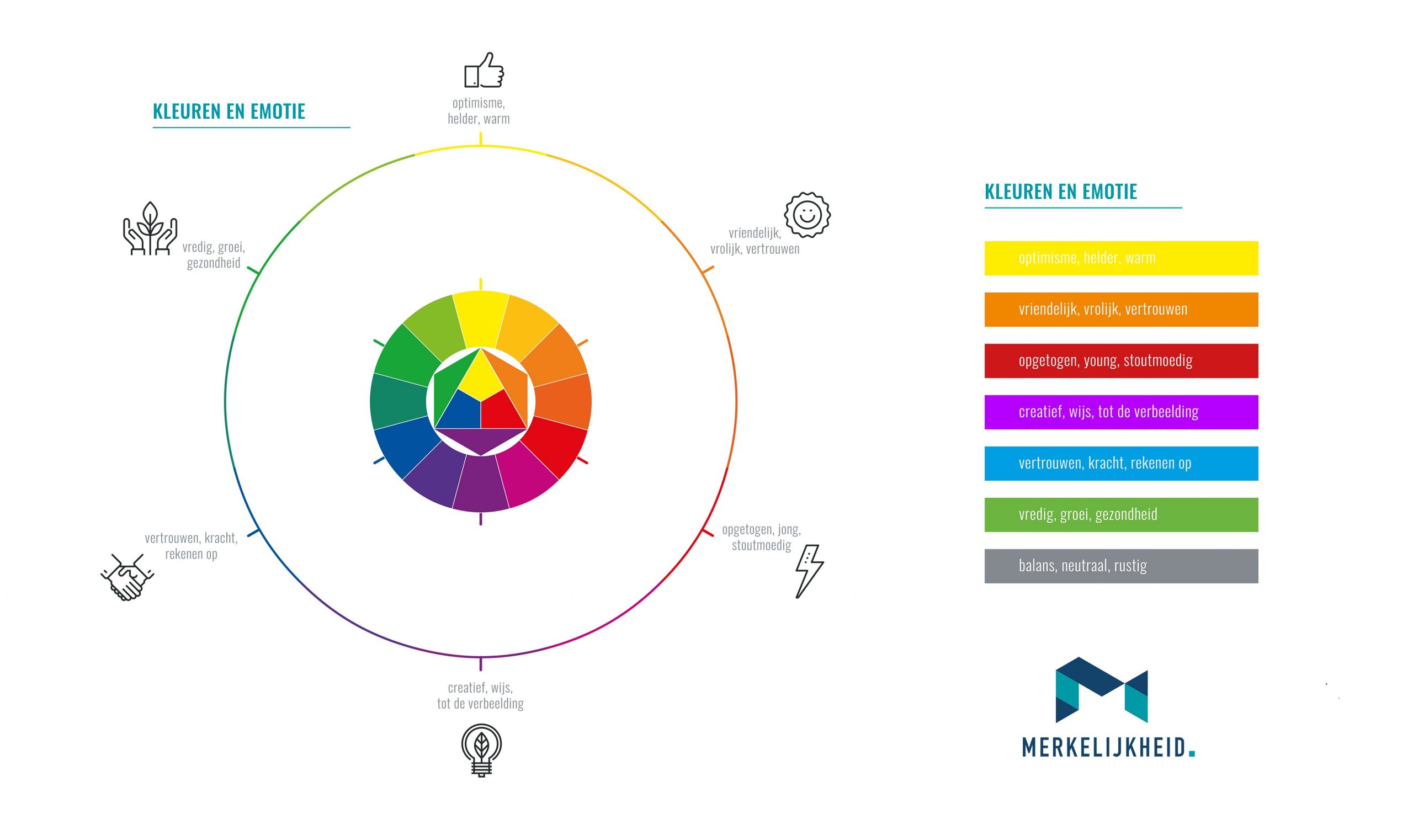 Colors and Emotion Wheel helps you determine the best fitting color for your positioning and brand identity. Click on the image to download the high-resolution file.
In terms of positioning and brand identity, the main considerations for choosing a color are:
- Color usage of the main competitors
- Positioning concept / desired brand archetype
Consequences of Color Usage by Competitors
Colors evoke feelings. It’s no coincidence that in many markets, the established market leader uses a lot of blue. Blue signifies trust, strength, and reliability.
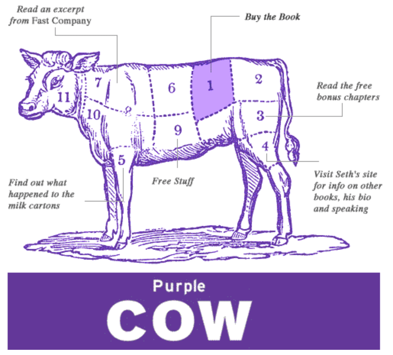
Even in your market, you need a purple cow.
In this market, it is unwise for a newcomer or new brand to also choose blue as the primary color. Why? Your main competitors have had years to link their brand to this color. At best, your also-blue brand will be seen as a variant of the same, and why would you switch then?
In many cases, the best decision will be to consciously distance yourself (position yourself distinctly differently) from the colors of your main competitors.
Strengthening Brand Identity and Positioning
Our brand must not only stand out, but it must also gain a preferential position in the buyer’s mind. How do we ensure that our brand identity and positioning reinforce each other?
Research shows that people prefer a brand whose brand and chosen color match. The brand ING decided a few years back to turn the tide; it wanted to become the preferred bank for the Dutch. It had to be a bank that enables people to move forward. The color orange not only fits the Dutch but also the emotion at the core of their positioning. People now recognize that orange fits ING. ING now scores higher than its major competitors ABN and Rabobank.
So, choose a color whose emotions align with the story you as a brand tell. Our wheel can nicely be used for that.
Examples of Color Use in Brand Identity
For each color, we discuss one or more brands where it forms the basis of the brand identity and how this color fits with the positioning.
Yellow as the Primary Color of Brand Identity
Yellow communicates optimism and clarity but also warmth. The shade of yellow is more important than other colors, a lighter variant communicates a low price where a darker variant rather carries playfulness.
A good example of the latter is the Caterpillar logo:
![]()
![]()
Rental company Hertz chooses a lighter yellow in a primarily price-driven market:
![]()
Orange as the Primary Color of Brand Identity
With orange, we associate terms like friendly, cheerful, and trust. Especially for the Dutch, there’s also a sense of nationalism. As we said earlier, one of the biggest Dutch banks, ING, claims the color orange for exactly this reason. But what are other brands that centralize orange in their brand identity?
![]()
The ‘Amazon-smile’ is executed in orange. The largest internet store wants to inspire trust, trust that consumers can turn to them for everything. And successfully so, founder Bezos has become one of the richest people on earth.
![]()
Also, Harley Davidson opts for orange with a brand that centers around freedom. When thinking of the rebellious brand, we envision the vast American roads and how it feels to ride a Harley towards the sunset. Who wouldn’t be happy about that?
Red as the Primary Color of Brand Identity
Red stands for excited, young, and brave. It’s not hard to find a brand that fits with red, as almost everyone thinks of the same brand, Coca-Cola:
![]()
The brand is undiminished positive and likes to connect to young people and the best moments in life. Whether it’s christmas or summer,Coca-Cola is there. For years, the slogan was ‘Always Coca-Cola,’ but with its experience-focused positioning, the company goes a step further.
Purple as the Primary Color of Brand Identity
Purple is strongly associated with royalty and has been for centuries a royal color. This is because of the exorbitantly high costs of making the dye, only rulers could afford it. But purple, and its many shades, we mostly associate with creativity, wisdom, and imagination.
![]()
The Milka logo uses especially the power that this traditional purple evokes and stays closer to the trusted blue. It invokes a kind of old wisdom, a brand that is reliable, that you can trust.
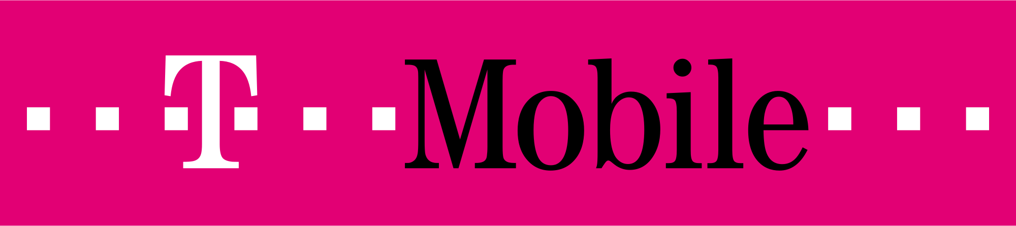
T-Mobile, with its variant, clearly opts for the more creative side of the color. The brand sets itself apart from the rest of the market, literally, because it managed to secure exclusive rights to its magenta. The brand wants to appeal to a younger audience and uses the color as a lever to attract and retain attention.
Blue as the Primary Color of Brand Identity
Blue is in many markets the color of the market leader and evokes trust, blue brands are reliable and strong.
![]()
Price fighter Dell set out to turn the computer market upside down. And it succeeded, the company has quickly climbed to the third market share. An impressive feat in a market dominated by IBM (later Lenovo) and HP. Both also brands with a blue logo, by the way.
![]()
Ford has been one of the largest car companies in the world for decades. The brand embodies with its massive trucks the strength and reliability people associate with the color blue.
Green as the Primary Color of Brand Identity
Green stands for growth, peace, and balance. Although the connection with nature is evident, that’s not the most important link certain brands have with the color.
![]()
First our ‘own’ Heineken. The color green, so the story goes, is associated with high-quality beer. Additionally, Heineken wanted to distinguish its brand from the ‘brown’ competition. That the brand strives for peace is also evident from the ‘smiling’ e’s in the logo itself, thus reinforced by the color green.
![]()
Starbucks positions itself as the ‘third place,’ the place besides home and work where you feel at home. That peace and balance the brand found in the color green and as much as the logo evolved, the color remained.
Sources:
- https://www.helpscout.net/blog/psychology-of-color/
- https://www.laneterralever.com/psychology-of-color-how-color-affects-brand-perception
- http://onlinelibrary.wiley.com/doi/10.1002/col.22180/full
- https://link.springer.com/article/10.1007%2Fs11747-010-0245-y
- http://www.emeraldinsight.com/doi/abs/10.1108/00251740610673332