The core of your brand identity: a strong logo
A strong logo is not only the business card but also the anchor of your brand. Samsung is a good example of this. The brand survived when the mobile phone market completely collapsed. Samsung kept up with the times, stayed true to its character, and is now the market leader in the smartphone industry. Samsung’s well-known blue logo has remained the same all this time and signifies stability and trust, the core values of Samsung.
![]()
Samsung’s logo inspires trust because people associate the round shape and blue color with it. The right shape and/or color combination evokes the emotional response that fits the character of a brand. Later in this blog, we will elaborate on this.
In this article, we will show, using several examples, how we arrived at the design of the logos for some of our clients. But before revealing our approach, let’s first look at some of our favorite logos.
Google’s logo was developed in 1998 and underwent almost no changes until 2015. Until 2015, the logo featured a serif letter and already consisted of the recognizable color combination of blue, red, yellow, and green. The color combination is essential to the logo’s success. It consists of 3 primary colors, making the logo always stand out. The green color is the odd one out as a secondary color. A deliberate choice by Google to clearly show that it is original and innovative and does not follow rules.
In 2015, a new design for the logo was introduced. The serif letter was replaced by a sans-serif letter with a slightly sharper color contrast. This gives the logo a more modern look without losing the approachable character of the letters.
![]()
Nike
Unlike Google’s word-logo, Nike is mainly known as a symbol. The logo was created in 1971 by American Carolyn Davidson. The woman – then a graphic design student at Portland State University – met Phil Knight during a lecture at her school, who was setting up a new running shoe brand. Knight asked her to create a logo that suggests movement or speed. Davidson came up with the famous design and initially received only 35 dollars for it. The rest is history.
The name Nike comes from Greek mythology. Nike is the goddess of victory and is depicted as a winged woman. The logo is one of the wings of this goddess.
The design is abstract, but Phil Knight’s message is clear. The upward line and sharp points evoke progress, movement, and power. It symbolizes victory, a nod to the goddess Nike. Originally, the logo was a combination of name and symbol. Over the years, the brand became so strong and well-known that the name was removed from the logo in 1995. Nike is the perfect example of a logo that evokes the right emotions through an abstract symbol.
![]()
How to determine a company’s logo
In recent years, we have designed logos for a large number of clients. The character of a company is always the starting point of the design. What does the company do? What are the company’s core values? What associations fit? Is the company traditional or progressive? We map out these questions and form the basis. Color and shape are ultimately the tools used to create a logo. We will briefly discuss them.
Logo color
Next, we conduct visual research. How do we translate the company’s story into a logo? Which colors, shapes, and effects fit? Different colors and shapes evoke emotions and are therefore an essential part of logo design. The influence of color on our subconscious and how you can use this is described in our blog ‘determining the best color for your positioning and brand identity’.
Logo shape
Besides color, shape also plays an important role in determining the logo. We know that certain shapes have their own emotions. A few examples:
Circles: unity, love, relationships, friendship
Curves: femininity, movement, happiness, fun
Rectangles: trust, peace, uniformity
Triangle: masculinity, power, energy, goal-oriented
Vertical lines: masculinity, power, strength
Horizontal lines: community, calm, peace
Based on these characteristics, we create a mood board of shapes, fonts, and colors. We create various designs, both abstract and word-logos.
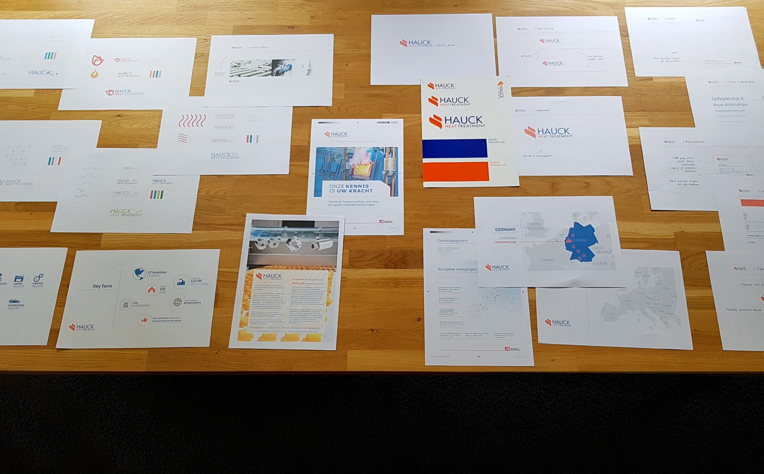
The creation of the Hauck Heat Treatment logo
We bundle the ideas and send them to the client. Then we discuss with the client to find out which ideas they prefer. We build on those. Eventually, we come up with several designs from which the client can choose. For Hauck Heat Treatment, the choice fell on this logo:
![]()
Hauck Heat Treatment is one of the key players in heat and surface treatment of metal. The use of capital letters in the design gives the company the masculinity and authority that fits the company and industry. The symbol next to the name represents heat or fire. This fits well with the company’s services.
Hauck Heat Treatment is an example of how a logo clearly symbolizes what the company can do and does. A logo can also represent a company’s character in an abstract way. Another example is our own logo. Merkelijkheid stands for no-nonsense, clarity, trust, and goal-oriented work. This feeling is represented in the logo by using a block structure of triangles and rectangles. The emotions that fit here align with the company’s identity.
![]()
In short, as part of your brand identity, a strong logo aligns with your brand positioning. Want to know more about positioning your brand? Then read our extensive article on positioning.