New Remarkable Reality of Remarkability
Who doesn’t know the story of the painter who finally needs to give his own house a new coat of paint? It was the same for us; with all the beautiful assignments, our own marketing often came last. A few months ago, we decided it was high time to tackle this structurally, and we got to work. We are proud to present to you the new remarkable reality of Merkelijkheid! A sharpened story, a new corporate identity, and a brand-new website.
The story, the positioning
![]() Our core business is searching for and creating remarkable (brand) stories. You would think that writing our own story would be “a piece of cake.” The reality proved otherwise, something we also always notice with our clients. The more involved you are with your own brand, the harder it often is to extract the core. In short, an outsider observing from a distance often gets to the core faster. That’s why we talked; with our clients, partners, and everyone who holds Merkelijkheid dear. From all those conversations, the following emerged in response to the question “what is Merkelijkheid”:
Our core business is searching for and creating remarkable (brand) stories. You would think that writing our own story would be “a piece of cake.” The reality proved otherwise, something we also always notice with our clients. The more involved you are with your own brand, the harder it often is to extract the core. In short, an outsider observing from a distance often gets to the core faster. That’s why we talked; with our clients, partners, and everyone who holds Merkelijkheid dear. From all those conversations, the following emerged in response to the question “what is Merkelijkheid”:
- Merkelijkheid ensures things get done (before the deadline)
- Merkelijkheid is able to hit the core and thereby elevate a brand or resources to a higher or next level
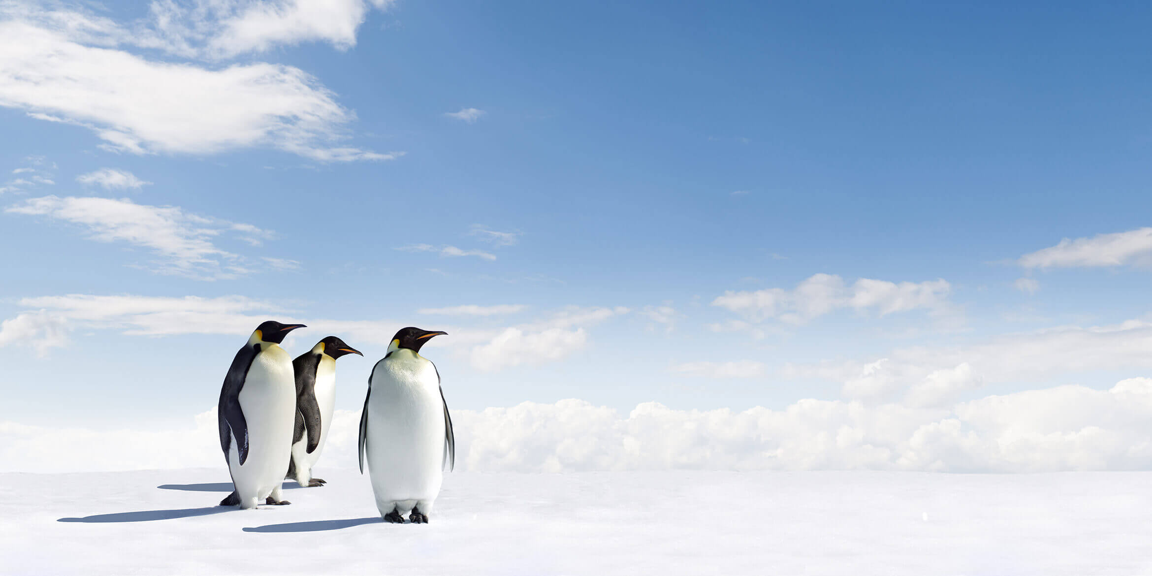
- The story of the penguins and their limited distinctiveness that you have been telling since the founding remains remarkable
These findings enabled us to reinvent our story, a story where the penguin again takes a more central role. Welcome back, penguin!
Corporate identity unites hard and soft aspects
After sharpening our story, we started working on a corporate identity that aligns with it and further strengthens our story. To begin with, the logo is composed of friendly softer blue tones combined with a sleek line pattern (planes). That is exactly what we stand for: the softer creative side combined with the harder project-based approach. As accent colors in resources such as the website, we use yellow and gray. Inspired by the emperor penguin in its natural habitat.
We also chose to continue as “Merkelijkheid” instead of “De Merkelijkheid.” The article “De” was once necessary at the founding in 2010 to add strength, but now, after 6 years, we can say that removing such unnecessary ballast, for example from the logo, only makes the brand stronger.
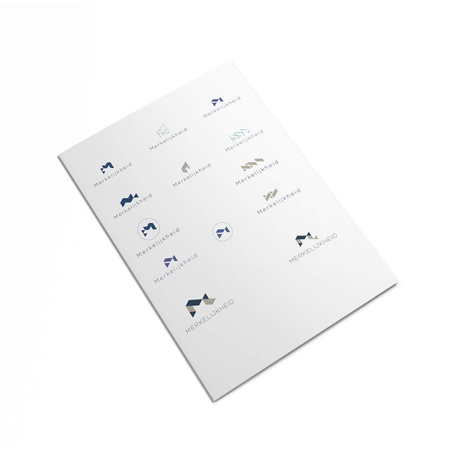
After extensive research, we chose the combination of two new fonts for us, Lato and Roboto Slab. While the sans serif font Lato looks sleek and minimalist, the combination in, for example, titles with the more classic Roboto Slab font creates that interplay. Strict on planning and deadlines, combined with the more creative softer side.
This corporate identity was implemented in our website and all other expressions.
New website is ready for the future
Where our previous site was ‘only’ responsive, this one is fully mobile-first developed. Why? We already wrote a blog about this, but in a nutshell, the reasons are:
- More and more people use their phone as their primary source of information
- Google gives mobile-first sites a higher ranking in search results
- We find it logical that if you take the trouble to visit our site, we do our best to make it as enjoyable as possible.
- We want to make the experience as intuitive as possible on all devices. That’s why we chose Material Design as the design direction, characterized by simplicity and flat design. Something that also fits well with our corporate identity, which is also characterized by simplicity and planes.
It was quite a challenge. We receive about 7,000 unique visitors per month who all consult our expertise in marketing, positioning, brand identity, annual reports, and websites. These articles and information sources all had to remain easily accessible and readable. In fact, they had to become even more accessible and readable.
The site speed has drastically improved (about 300%) and, in our opinion, the readability as well. Hopefully, no errors slipped in, but if you encounter any during your first visit, please let us know.
What should you definitely check out? Our Portfolio probably gives a good impression of what we enjoy: realizing distinctive positioning and fantastic resources for our clients.
With thanks to
As already mentioned, we could not have done this without the input of all the people who hold Merkelijkheid dear. Thank you for your time, effort, and valuable feedback! We are very curious to hear what you think of the final result.