Do’s and don’ts for using images in your annual report
Hoe zorg je ervoor dat de vorm van je jaarverslag aansluit op de boodschap? Een stevige uitdaging want zoals we allemaal weten; hoe je iets zegt is minstens zo belangrijk als wat je zegt. Fotografie en beeld zijn mee van de belangrijkste tools die een communicatiespecialist tot haar beschikking heeft. Hoe zorg je ervoor dat ze het juiste gevoel aan het jaarverslag verbinden?
Natuurlijk hebben wij op dat vlak een hele rits aan praktische ideeën en tips (we houden ons hier dagelijks mee bezig) maar in dit artikel doen we het anders. We kijken naar drie aansprekende merken en hoe zij beeld in hun jaarverslag gebruiken. Ik vertel wat er goed gaat maar ook wat beter kan.
We bespreken de volgende voorbeelden:
- Heineken Jaarverslag 2017
- KPN Jaarverslag 2017
- Rabobank Jaarverslag 2017
Na de drie voorbeelden deel ik samenvattend een lijst met dont’s.
De merkstrategie van Heineken
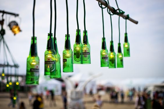
Heineken Nederland wil een uitdagende, innovatieve, trotse en onderscheidende leider in de Nederlandse levensmiddelensector zijn. Ze zijn productleader in de Nederlandse bier- en cidermarkt, en een onafhankelijke wereldwijde brouwer. Hun marketingstrategie is productleadership: excelleren op productkwaliteit, innovatie en merkmarketing. De volgende kernwaarden hanteren ze: Plezier, Passie voor kwaliteit, Respect voor mens en milieu. Heineken heeft natuurlijk verschillende submerken, maar hoofdmerk is Heineken pils en dat staat voor avontuur en beleving: waar drink je het?
Heineken jaarverslag 2017
Het jaarverslag van Heineken is zowel te downloaden als PDF als online te bekijken. Wat direct opvalt is dat er aardig wat foto’s in staan maar niet groot en ook telkens met afwijkende fotoverhoudingen. Dit zorgt voor een wat onrustig ogend geheel en je aandacht wordt niet naar een bepaald beeld geleid, dus een lastige focus. Ook zijn sommige afbeeldingen zo klein dat je niet snapt waar het nou precies om draait. De consistentie ontbreekt.
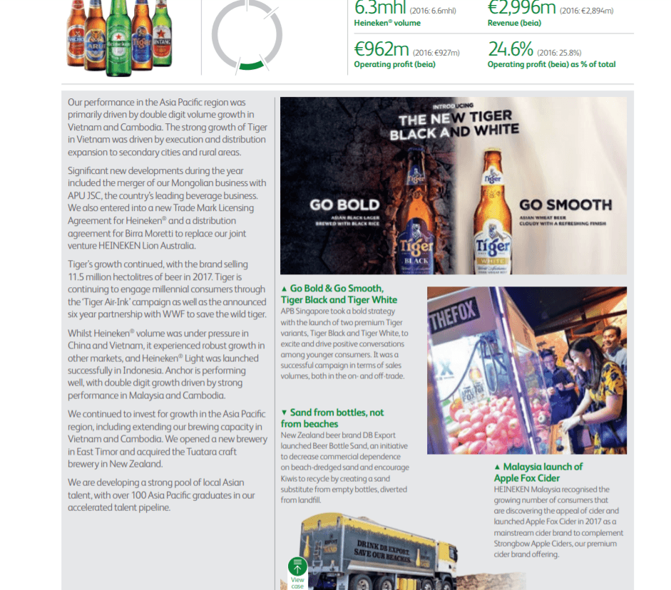
Het beeld dat Heineken in haar verslag gebruikt voelt ‘samengeraapt’. De stijl en kleurstelling verschilt per foto en maakt het grafisch strak opgemaakte verslag rommelig ogen. Zeker gezien het feit dat Heineken maar beperkt gebruik maakt van beeld vinden wij dit een gemiste kans. Het verbaast ons ook behoorlijk, voor een wereldwijd opererende speler met een marketingfocus zou het toch geen punt moeten zijn om een consistente beeldtaal te communiceren (en aan te leveren)?
 Mede doordat het als gevonden beeldmateriaal overkomt zonder veel focus en gebrek aan consistentie, oogt het in zijn totaal als een nieuwsflashpagina of een knip en plak boek met interessante artikelen en plaatjes, maar vormt het geen geheel. In de foto’s onderling is niet één lijn te ontdekken qua stijl want:
- geen overkoepelend concept
- geen keuze voor mens of product
- geen eenduidig gebruik van kleuren
- het licht is telkens anders
- het ene beeld is rustig, het andere druk
- soms een totaalshot en soms een close-up
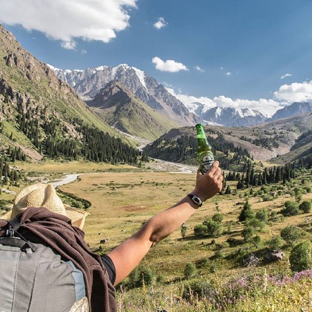
Als we kijken naar de merkbelofte dan zien we dat vooral het respect voor mens en milieu in beeld benadrukt wordt. Ook het feit dat het een globale, internationale speler is, is goed te zien. Dit doordat de beelden die ze gebruiken vooral groene tinten bevatten (ook vanwege Heineken groen uiteraard), een buitenomgeving / natuur toont en mensen die op het land aan het werk zijn. Mensen met verschillende nationaliteiten en kantoren in allerlei landen zijn afgebeeld.
Do’s
 In het eerste deel van het jaarverslag vind ik dat de merkbelofte en boodschap nog onvoldoende benut en uitgedrukt wordt. Laat niet alleen een deel van maar de gehele merkbelofte zien. Je kan verspreid over het jaarverslag meer afwisselende beelden plaatsen die bijvoorbeeld:
- De overige kernwaarden meer benadrukken en de belofte van het hoofdmerk Heineken pils en het daarbij behorende avontuur en beleving verbeelden (zie afbeeldingen). Je zou bijvoorbeeld een reeks sfeerbeelden kunnen maken in allerlei situaties dat men Heineken drinkt. Iemand bij een kampvuur in de natuur, iemand die net klaar is met een uitdagende werksituatie en tijd voor een biertje, een daredevil die op moment suprême een biertje aangereikt krijgt. Of laat medewerkers zien die een spil zijn in het grote proces, de boer op zijn land, de brouwer in de fabriek, de vervoerder op een boot, de CEO tijdens een tasting. Op deze manier combineer je in één klap het persoonlijke gezicht met plezier en de passie voor kwaliteit (in beeld brengen van verschillende schakels die met passie aan één gezamenlijk doel en merk bouwen) en doe je meer aan storytelling in je jaarverslag.
- Één lijn zoeken in stijl en gebruik van beeld, denk aan / let op herkenbaarheid, kleur, grootte, verhoudingen, rust (of juist bedrijvigheid), het ritme verspreid over de pagina’s en een vast format.
De merkstrategie van KPN
Doel van KPN is het leven vrijer, leuker en makkelijker te maken door mensen te verbinden. Ze werken aan hun veilige, betrouwbare en toekomstbestendige netwerken en diensten, zodat alles en iedereen altijd en overal verbonden is en om tegelijkertijd een welvarendere en schonere wereld te creëren. De drie belangrijkste kernwaarden zijn: klant, samen en eenvoud. De vraag is: zien we dat terug in het jaarverslag?
KPN: Iedereen verbonden
KPN Jaarverslag 2017
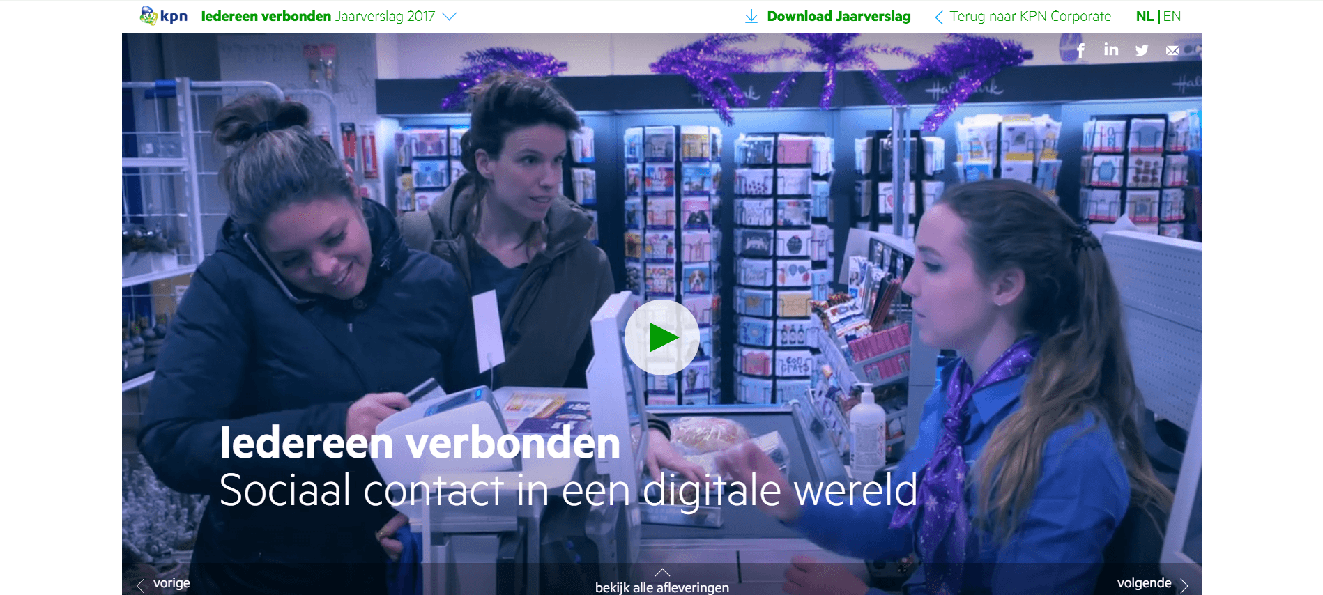
Het jaarverslag van KPN is een online jaarverslag met een downloadbare uitgebreide printversie. Het eerste dat duidelijk wordt, is dat ze de slogan daadwerkelijk een gezicht hebben gegeven, een boegbeeld voor KPN. De dame in kwestie, Gian van Grunsven, prijkt op de voorkant van het jaarverslag en het online jaarverslag begint met een documentaire van 21(?!) minuten waarin deze journaliste op onderzoek uitgaat en haar directe omgeving ondervraagt.
Ik juich het gebruik van foto en video toe. Het liefst ook nog op een creatieve wijze weergegeven. En dit is zeker een poging om het jaarverslag creatief beeldend vorm te geven. Met de nadruk op poging. De poging kan ik waarderen, maar wat slaan ze de plank mis met deze film. KPN koopt de afgeleide integriteit van een journaliste met als doel het merk te promoten. Onder de schijn van objectiviteit brengt het merk haar producten en diensten aan de man, Gian’s onderzoek pakt wonderlijk genoeg uitstekend uit voor het merk. Het doet afbreuk aan de geloofwaardigheid van de journalist én aan het merk KPN.
Enzo Knol komt ook in die video voor, wél een rake keuze. Het is een vlogger die bij het merk past: als iemand gebruik maakt van mobiel en internet, dan is hij het wel. Hij pretendeert ook nooit objectieve items te maken en zou dus een oprechter boegbeeld zijn.
Do’s
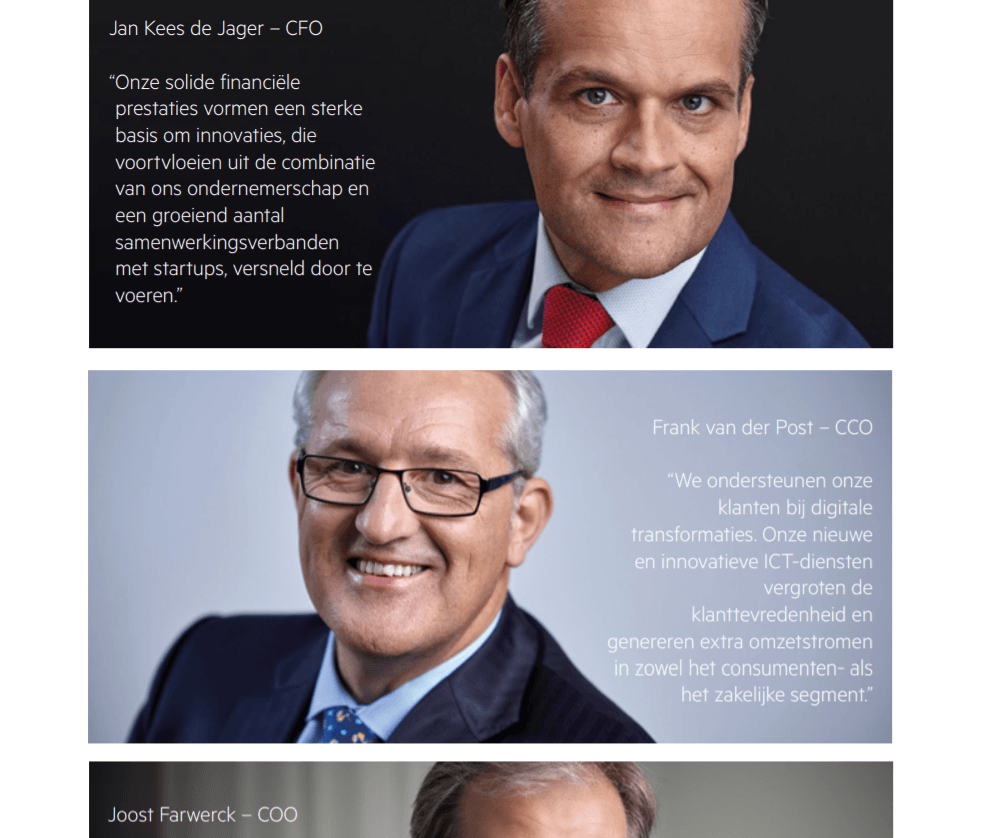
 Overig beeld in het jaarverslag: de portretten zijn goed van kwaliteit. Er zit echter geen lijn in: de een heeft een donkere achtergrond, de andere een lichte achtergrond, ook de belichting is telkens anders. Dat kan eventueel, maar plaats portretten die qua stijl niet overeenkomen niet op dezelfde pagina. Ook kijken de mannen wat onnatuurlijk en geforceerd.
- Een film die centraal staat en het jaarverslag ‘opent’: ja! Maar de film is te lang, hou het dus kort en bondig.
- Gebruik er geen journaliste voor. Journalistiek staat voor een objectief en onafhankelijk verslag. Kies iemand die beter bij het merk past. De vlogger bijvoorbeeld.
- De film zelf heeft een hoog amateuristisch en geforceerd gehalte. De versnellingen, het riedeltje in het begin, de ongemakkelijke starende blik van de journaliste, de outfit die ze de gehele film aanheeft waardoor het lijkt alsof alles in een dag – en dus snel- is opgenomen, de té ingestudeerde scenes en opgedreunde zinnen. Het werkt nu gewoon niet. Neem de tijd voor de opnames, let op details en zorg voor een professionele editing.
 Overig beeld in het jaarverslag: de portretten zijn goed van kwaliteit. Er zit echter geen lijn in: de een heeft een donkere achtergrond, de andere een lichte achtergrond, ook de belichting is telkens anders. Dat kan eventueel, maar plaats portretten die qua stijl niet overeenkomen niet op dezelfde pagina. Ook kijken de mannen wat onnatuurlijk en geforceerd.
KPN heeft wat mij betreft een kans gemist met dit jaarverslag.
De merkstrategie van Rabobank
De Rabobank is een maatschappelijke bank. Ze willen een substantiële bijdrage leveren aan het welzijn en de welvaart in Nederland en de oplossing van het voedselvraagstuk in de wereld. Hun ambitie is de meest klantgerichte bank van Nederland te zijn en een leidende food- en agribank in de wereld, de dichtbij-bank.
De 4 kernwaarden zijn respect, integriteit, professionaliteit en duurzaamheid. Hoe wordt dit verbeeld in het jaarverslag?
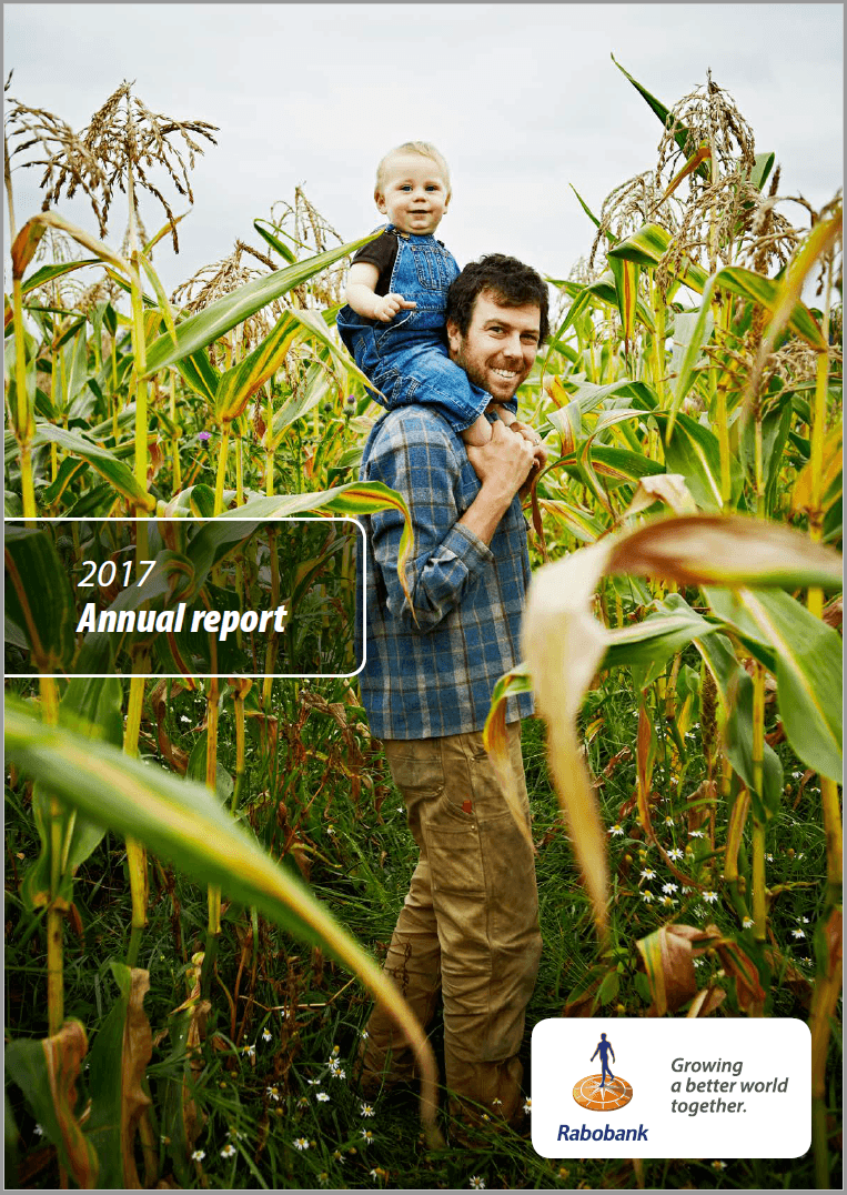
Het jaarverslag van Rabobank
Het jaarverslag van Rabobank bestaat uit een downloadbare PDF en geprinte versie. Geen online verslag.
Rabobank vind ik een voorbeeld van een jaarverslag dat er goed uitziet. Beeld ontbreekt er zeker niet in. Het jaarverslag is overzichtelijk ingedeeld en tot de appendix zit het vol met foto’s.
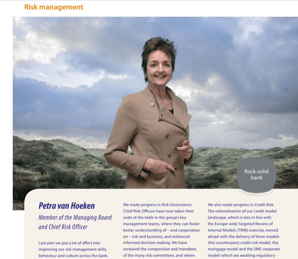
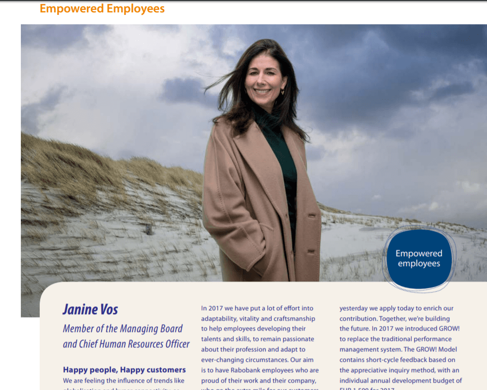
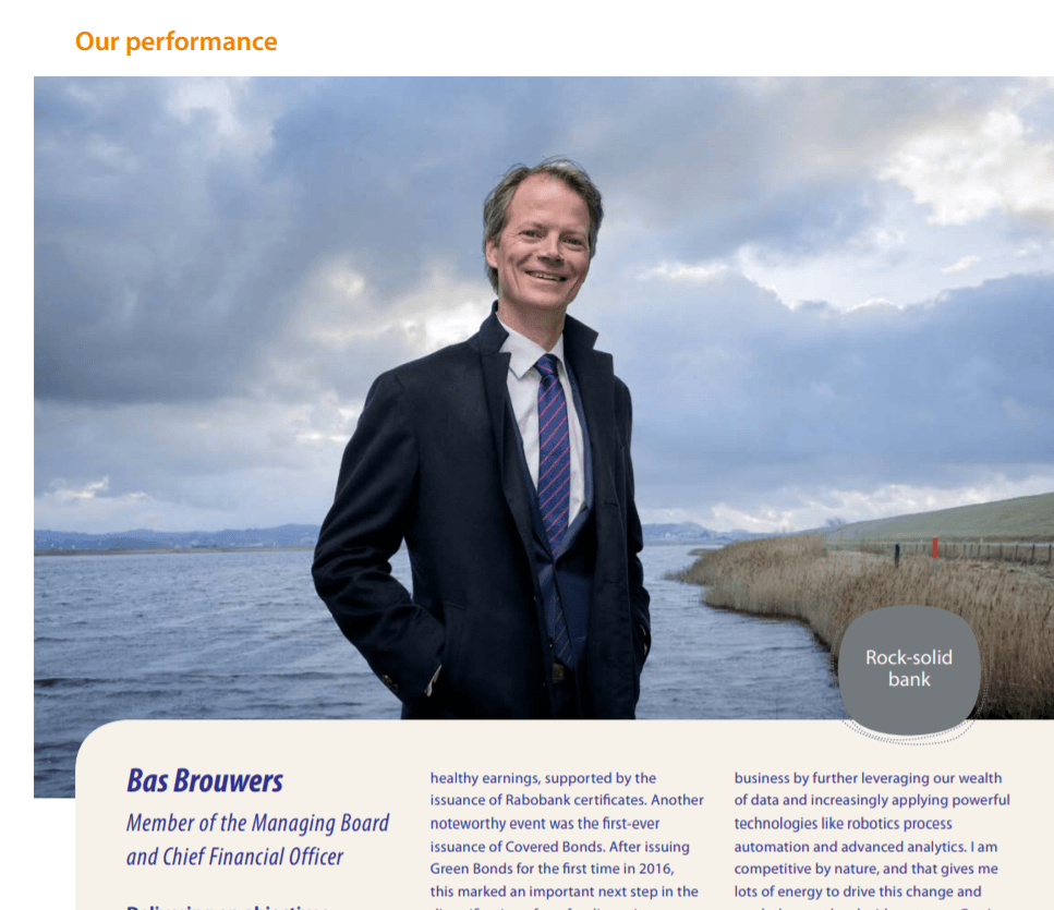
Sterke portretten in het Rabobank jaarverslag
Wat je ook heel duidelijk aan dit jaarverslag ziet is dat de beelden die erin staan daadwerkelijk gemaakt zijn voor dit document. Het ondersteunt de boodschap op 2 manieren:
- De boardleden zijn allemaal geportretteerd op een oprechte en sympathieke manier. Het komt natuurlijk en ongedwongen over. Als ik de mensen zie dan heb ik een positief gevoel bij hen en heb ik echt het gevoel dat ik het gezicht erachter zie en een connectie voel.
- Daarnaast is de stijl en omgeving van de portretten niet over het hoofd te zien: allen zijn ze in de natuur geportretteerd in een warme jas met soms een hoedje of sjaal. Ook dit benadrukt de menselijke kant (we zien hen niet alleen in werkomgeving en werkkleding), en daarnaast oog voor milieu en omgeving; de “better world” uit de slogan. Het is een gebalanceerd geheel en door het management in natuur te plaatsen is de kloof met de andere gebruikte beelden klein, en het bruggetje gemaakt.
Het enige dat mij stoort is dat er behalve de geportretteerden verder zó weinig beelden in staan dat de foto’s díe erin staan, allemaal wel heel erg de aandacht opeisen. Als je dan ziet dat de enige foto die er paginagroot van klanten instaat een foto van een homostel is, voelt dit toch een beetje als de excuushomo’s.
Do’s
- Natuurlijk is het logisch dat je als merk een doorsnede van de samenleving wilt uitstralen en allerlei soorten en maten klanten wilt bereiken. Maar zorg dan dat áls je een doorsnede van de samenleving wilt laten zien, je dat doet door middel van meerdere beelden en dat je met de hoeveelheid en afwisseling een verhaal vertelt en je boodschap uitdraagt. En niet dat die ene foto díe erin staat, nou per ongeluk net een foto van een homostel is.
- Buiten de portretten om net wat meer sfeerfoto’s plaatsen. Drie stuks zouden het verschil al maken.
Conclusie: de belangrijkste don’ts voor jouw jaarverslag
Uit de hierboven beschreven jaarverslagen halen we de volgende dont’s:
- Niet alleen terugblikken. Behalve terugblikken is het juist fijn om ook naar de toekomst te kijken. Wat we sowieso als ontwikkeling zien is een 24/7 jaarverslag, een platform waar men continue aanvult. Zorg in dit kader dat je pro-actief bezig bent met het vastleggen van ontwikkelingen en gebeurtenissen binnen je bedrijf en zorg dat je personeel dit ook bewuster onderdeel van hun systeem maakt.
- Gebruik niet enkel bij elkaar geraapt beeld. Vraag een corporate fotograaf om foto’s te maken voor je jaarverslag en zorg voor een duidelijke briefing.
- Te weinig beelden of film plaatsen. De leesbaarheid van het verslag gaat erop vooruit als je een mooie balans hebt tussen tekst en beeld en maakt het lichter en minder taai.
- Wat ik vaker zag is dat niet de gehele merkbelofte & kernwaarden belicht werden. Focus niet op een klein deel maar verbeeld de rest ook.
- Plaats niet alleen portretten, maar doe aan storytelling door middel van sfeerbeelden en video. In een sterk concurrerende markt waarbij het product er minder toe doet en het merk, gevoel en attitude veel belangrijker is, is beeld bij uitstek een ideaal middel.
- Ik zag nog te vaak dat er geen consistentie was in de gebruikte beelden. Maak er een duidelijk samenhangend geheel van (denk aan stijl, licht, verhoudingen, onderwerp, ritme enz.).
- Beeldgebruik wordt zeker toegejuicht, maar zorg dat de boodschap duidelijk is. Beter geen vage foto’s waar de lezer niets mee kan. Hou filmpjes kort en bondig.
- Geen samenwerkingen met personen & merken aangaan die niet bij je eigen merk passen. Boegbeelden zijn leuk en kunnen goed werken. Zorg dat je een persoon kiest die aansluit bij de doelgroep.
- Dat geldt overigens voor al het beeldgebruik: denk aan je doelgroep(en).
- Beeld is geen sluitpost. Neem de tijd voor het inventariseren en creëren van beeldmateriaal. Dit begint bij een jaarverslagconcept en eindigt in de nabewerking. Meer tijd zorgt ook voor meer oog voor detail.
- Negatieve of positieve discriminatie vermijden. Ja, we willen allemaal een doorsnede van de samenleving laten zien. Breng die boodschap dan door middel van de hoeveelheid en afwisseling aan beeld en niet door in één foto bij wijze van spreke één roodharige, één Aziaat en een donker homostel te tonen met ook nog een gehandicapt kind.
- Toon niet alleen portretten waarop vooral oudere, blanke mannen glimlachen en in pak met stropdas poseren als je het in het verslag vaak over diversiteit en man-vrouw verhoudingen hebt.