*Brand identity
Font and Brand Identity: The Psychology Behind Your ‘Font’
How to Choose a Font for Your Brand: The Psychology of Fonts
Choosing the right font for your brand involves more thought than you might expect. There is a psychology behind fonts known as the “psychology of fonts” that plays a significant role in how people perceive and connect with your brand. So, how does this psychology work, and what factors should you consider when selecting a font? Let’s explore all the aspects involved.
Different font styles often evoke certain associations in the minds of readers, often subconsciously. The font style is, therefore, a crucial but often overlooked factor in aligning brand identity with positioning. A brand becomes more cohesive and compelling when the font style logically aligns with its positioning. Font choice not only influences your customers’ feelings but also plays a vital role in the readability of your text. We’ll delve into the most critical aspects of fonts in this article.
Serif vs. Sans Serif Fonts
Serif and sans serif refer to all types of fonts.

Letters with serifs are characterized by the small strokes or lines at the ends of each letter. These strokes give the letters a sense of flowing into one another.
Sans serif lettertypes, on the other hand, do not have these strokes. These letters appear simpler and more straightforward.
So, fonts can belong to either the serif family or the sans serif family. Let’s take a closer look at both:
Serif Fonts
Serif fonts are characterized by a more elegant appearance and are sometimes referred to as Roman fonts. Beauty and tradition are often associated with this type of font. Examples of brands that use serif fonts include the Italian jewelry brand Ti Sento and the automotive brand Mercedes.
![]()
![]()
Famous serif fonts include:
1. Times New Roman
2. Georgia
3. Garamond
Sans Serif Fonts
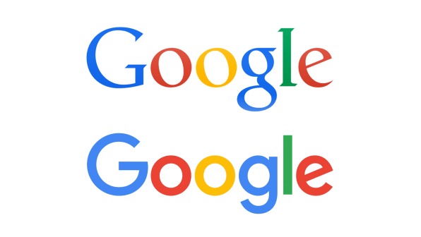
Sans serif fonts have a more informal and modern appearance compared to serif fonts. This type of font looks minimalist, powerful, and conveys a no-nonsense feeling. In recent years, this font style has become increasingly popular among brands. For example, both Google and Yahoo! replaced their original serif logos with cleaner sans serif designs. Another well-known example of a sans serif logo is Facebook.
![]()
![]()
Famous sans-serif fonts include:
- Verdana
- Arial
- Helvetica
Bold or Thin Font for Brand Identity
Another consideration when choosing your font is the thickness and size of your text. Light fonts are often used for brands with a ‘softer,’ more feminine image where design and style are important. Bold fonts convey a strong image and are mainly associated with strength and masculinity.
Examples of brands with thin fonts include Jimmy Choo and Hunkemoller. These brands emphasize the femininity of their products. In contrast, Diesel and Levi’s, which come across as more masculine and rugged, use bolder fonts.
![]()

Capital Letters or Lowercase Letters
We encounter countless letters every day, and the majority of them are, logically, lowercase letters. This has an impact on how our brains respond to lowercase and uppercase letters. Because we are so accustomed to lowercase letters, they create a sense of engagement. Therefore, lowercase letters convey trust and friendliness.
When something is written in uppercase letters, it is usually to attract attention, provide a warning, or convey a certain authority. The use of uppercase letters in your brand identity creates an influential, dominant appearance.
There are plenty of examples of well-known brands that use lowercase letters in their logos: Amazon, eBay, Facebook, and BP are some examples of large companies that use lowercase letters in their logos to convey an approachable and familiar feeling to their customers.
Other brands opt for a large, strong presence in the market with logos often in bold uppercase letters. Some examples of these logos include DIESEL, IKEA, Calvin Klein, and Nescafe.

Lettertypes and Cognition
Another crucial factor in choosing your font is its effect on cognition. By cognition, we mean the readability and reading speed of text. Not only does the font have an impact, but also factors like line length, letter spacing, and color contrasts in your communication.
Let’s go through them:
Font Size
Recent research has shown that font size affects the readability of texts. This is especially applicable to website text and to a lesser extent to logos. A study by M. Bayer, W. Sommer, and A. Schacht from 2012 (see sources) found that a larger font size creates a stronger emotional connection with the target audience. Many websites use a smaller font size like 10pt-12pt, so try experimenting with larger sizes like 16pt or 18pt. You’ll notice that they are more pleasant to read and quicker to digest.
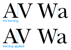
Letter Spacing (Kerning)
Kerning refers to the white space between individual letters. Most fonts have a default kerning that ensures good readability. If you are a designer and want to create your own font, always pay attention to the letter spacing. Some letters tend to merge together when they are too close to each other, which can negatively affect text readability.
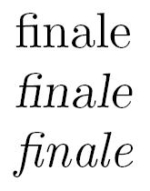
An exception to this rule is the use of ligatures. Ligatures are a typographic solution where letters that don’t look good together are connected to improve readability. Ligatures are often used with letters like “f” and “i.” In the example, you can see how these letters are merged into a single character for better readability.
Line Length in Text
Another factor that affects readability is the line length in your text, meaning the number of characters in each line. Ideally, a line should consist of 50 to 75 characters. When a sentence is broken too early, it disrupts the reader’s rhythm because they have to quickly go back to the beginning of a sentence. This can be tiring and make the text less efficiently readable.
A well-crafted, readable text has a varied rhythm. Long sentences (>80 characters) are rare, as are short sentences (<40 characters). The majority should fall within the ideal line length. However, it’s the variation that makes a text easy to read. There are various tests to assess the readability of a text, such as:
English: Hemingway text writing tool (http://www.hemingwayapp.com/)
Dutch: Accessibility Leesniveau Tool (https://www.accessibility.nl/kennisbank/tools/leesniveau-tool)
The widely-used WordPress plugin Yoast SEO includes a readability tool.
Contrast
Another important tip for readability on your website is to use sufficient contrast between text and background. You want to ensure that older people, people with visual impairments, or those who are colorblind can read your text easily without straining. Don’t underestimate this – one in twelve men is colorblind and is likely to struggle with yellow text on a white background, for example. Avoid using busy images as the background for your text. Opt for a plain background with text that sufficiently stands out in relation to the background.
The positioning of your brand is a determining factor in choosing a font and should be central to your brand identity. A font that aligns with your brand’s character strengthens your brand even more. Think carefully about this before launching your brand into the market!
Bronnen: