Brand archetype Magician: does your brand make dreams come true?
Do you believe that anything is possible? You’re certainly not alone. Flight, Bluetooth, electric vehicles, photography—these were all once dismissed as impossible until a true Magician brought them to life. Does your company harbor similarly bold dreams? Do you believe in your own power to reshape reality and tackle challenges with relentless problem-solving and grit? If so, your brand is almost certainly a Magician.
Defining the Magician Archetype
The Magician (or the Alchemist) excels at turning the negative into the positive. They make the impossible possible and turn dreams into reality. A Magician lives by a powerful vision. They rely on their own deep expertise; if a goal isn’t immediately met, they look inward, asking, “How must I evolve to achieve this?” Consequently, the Magician is a seeker of knowledge, driven to master the laws, rules, and hidden connections of the world around them. Focused and self-contained, the Magician leads with quiet authority rather than noisy arrogance.
Relationships with a Magician are rarely about “brainstorming” or equal-footing collaboration; they are transactional and result-driven. You ask, they deliver. You can trust that their solution will not just work, but inspire wonder. Because the focus is on the miraculous outcome rather than the process, customers rarely understand exactly how a Magician achieves their results. They simply trust that the magic will happen.

Rolls Royce: The gold standard of the Magician archetype.
The Three Levels of the Magician
Every archetype matures through different stages. For the Magician, these degrees of “magic” are:
Level 1: Fleeting Moments of Wonder
The brand leaves the customer feeling amazed, satisfied, and delighted. These experiences are often temporary and sensory—a quick transformation that fulfills an immediate need. Think of Polaroid’s instant results, the transformative scents of Rituals, or Smirnoff’s “filtered” perspective. Even wellness resorts and luxury hotels operate here, offering a temporary escape. A perfect example is the Smirnoff campaign where the world is transformed when viewed through the bottle. If the glass can do that, imagine what the vodka can do.
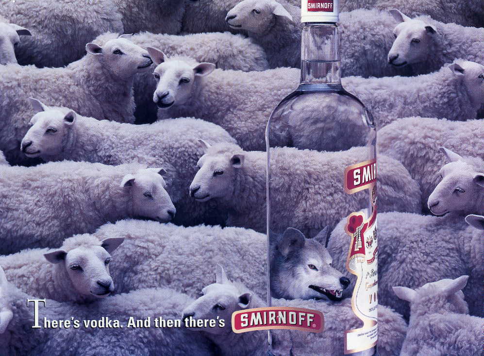
A visual from Smirnoff’s transformative campaign.
Level 2: The State of Flow
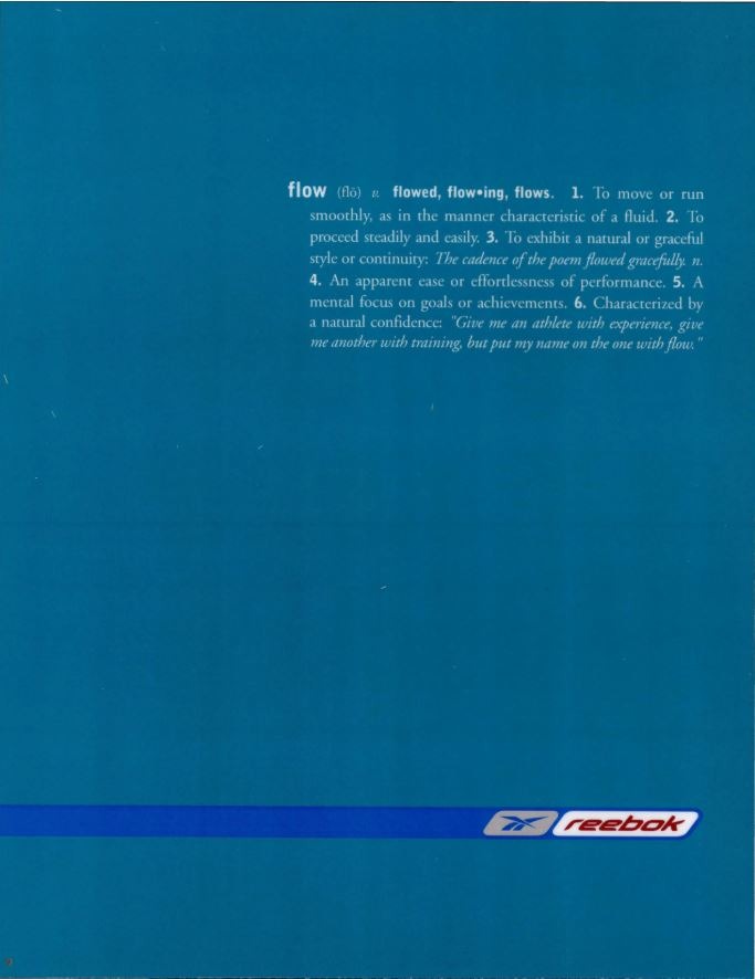
Reebok’s ‘Flow’ campaign.
At this level, magic isn’t just a moment; it’s a state of being. It’s about finding your “flow”—a long-lasting sense of satisfaction and peak performance. It’s a holistic experience where physical and mental health align perfectly. Reebok’s ‘Flow’ campaign is a prime example, showing an athlete who doesn’t just dream of success but lives it. The seamless transition between effort and achievement is the hallmark of Level 2 magic.
Level 3: The Miracle
Level 3 is the ultimate realization of a grand vision. It is, quite simply, a miracle. This is the most mature and impactful form of the Magician, requiring years of innovation to achieve. Global giants like General Electric and AkzoNobel—which we’ll explore below—operate at this peak.
The Magician in Professional Services: General Electric
The General Electric logo: A classic Magician mark.
General Electric (GE) is a multinational titan, operating in 180 countries. As a conglomerate, they touch everything from jet engines and wind energy to healthcare and finance. For B2B giants, maintaining a Magician persona is an immense challenge, but GE’s approach is the industry gold standard.
The Power of the Pay-off
Look no further than their slogan: “Imagination at Work.” It’s a definitive Magician statement. Its predecessor, “We bring good things to life” (1979–2003), proved that GE has leaned into this “miracle-working” identity for decades. Originally created by BBDO to unify GE’s diverse business units under one banner, the campaign cost $100 million and became one of the longest-running corporate identities in history.
Replacing it in 2001 with “Imagination at Work” was a bold move led by incoming CEO Jeff Immelt. He wanted to return the company to its roots: ‘innovation across all fronts.’ This required the revival of creativity and vision. Another $100 million and 18 months later, the “Pen Sketch” campaign was launched, symbolizing the moment a spark of imagination becomes a reality.
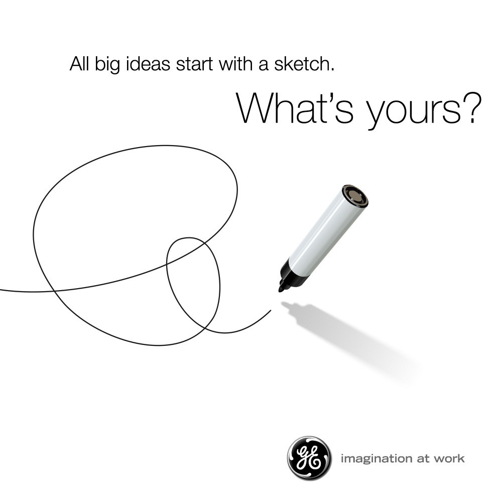
The ‘Pen Sketch’ campaign for ‘Imagination at Work’ – GE.
GE’s Visual Storytelling
If you still doubt their Magician credentials, watch “The Anything Factory” by their Additive division. It features a girl sneaking into a mysterious factory where products are manifested through what looks like pure alchemy. Or “Catch the Wind,” where a young boy catches wind in a jar to give his grandfather a birthday miracle. Even the dancing elephant in the “Singing in the Rain” spot—meant to highlight eco-friendly tech—showcases GE’s ability to create wonder out of industrial complexity.

A still from ‘The Anything Factory’ for GE Additive.
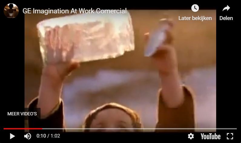
A still from ‘Catch the Wind’ for the Wind Energy division.
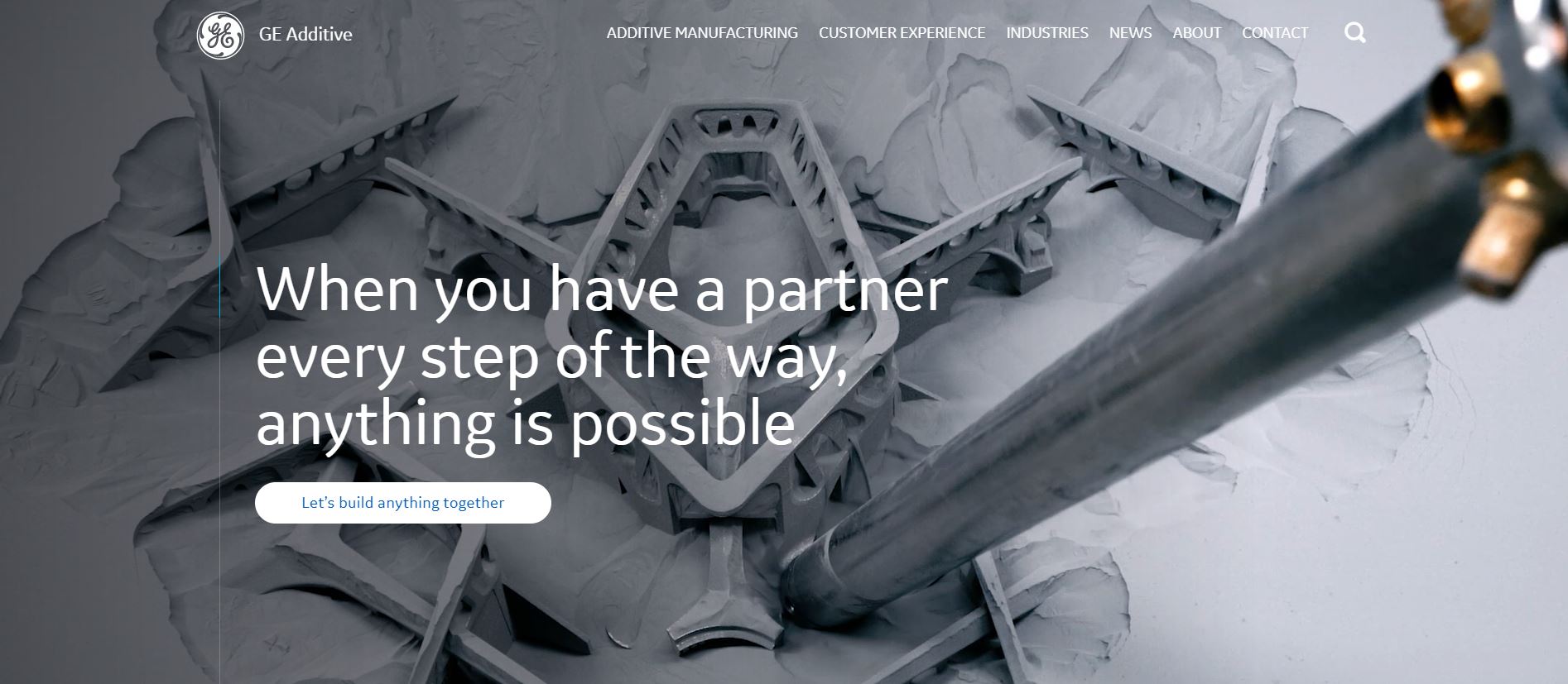
GE Additive: Innovation as magic.
Digital Identity and Authority
While GE’s homepage remains grounded—avoiding over-the-top mysticism to maintain professional authority—the Magician is hidden in the copy. The text is peppered with words like ‘progress,’ ‘transformation,’ and ‘innovation.’ The elegant, thin font and deep blue palette project authority and trust.
Even the logo, updated in 2004, reflects the archetype. It evokes the graceful flourish of a magician’s wand, while the circular motion emphasizes a company that is constantly evolving and reshaping the future.
The Industrial Magician: AkzoNobel
AkzoNobel: Master of the ‘Let’s Colour’ transformation.
Dutch multinational AkzoNobel is a world leader in paints and coatings, with 34,500 employees across 80 countries. While they serve consumers, their B2B presence in infrastructure, transport, and industry is where their “transformative” power truly shines.
In 2011, they unified their consumer brands under the “Let’s Colour” strategy—an invitation to transform your world through the magic of color. This same theme of radical transformation is the heartbeat of their industrial marketing.
Visual Language and Copy
AkzoNobel’s digital presence is a masterclass in color. The site uses bold gradients and overlays to show the power of paint. It doesn’t just say what they do; it shows the magical effect color has on homes, workplaces, and public spaces.
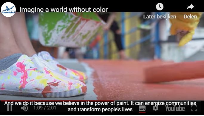
A still from AkzoNobel’s ‘Imagine a World Without Colour’ campaign.
Their ‘About Us’ page and corporate films lean heavily on Magician keywords: “how we’ve been changing the world,” “paint the future,” and “transforming people’s lives.” It’s classic Magician positioning.
High-Impact Partnerships
AkzoNobel’s Magician persona is best seen in their high-profile partnerships, which bridge the gap between industrial utility and creative wonder.
From Myth to Urban Reality
This project saw 26 street artists transform the cityscape of Gothenburg, Sweden, with massive murals. AkzoNobel provided the palette to bring ancient folklore into the modern urban environment. The result was a fusion of high-tech materials and ancient storytelling, breathing new life into local neighborhoods.
- 400 liters of donated paint,
- A traveling exhibition across 13 municipalities,
- Using the latest tech to bring folklore to life.
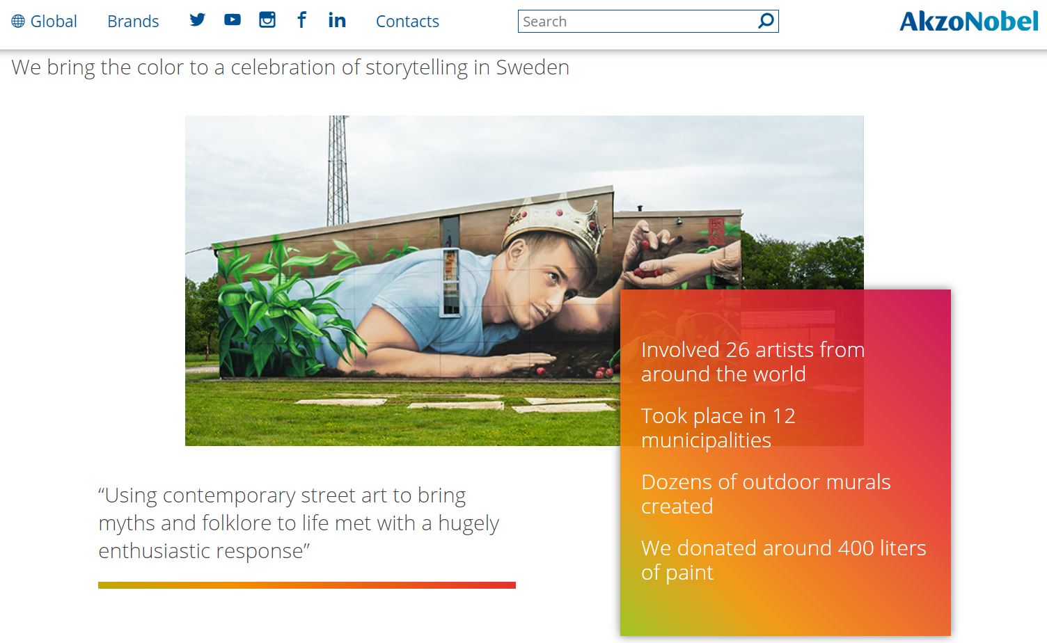
‘From Myth to Urban Reality’ project.
Operation Night Watch
Their partnership with the Rijksmuseum is perhaps their most “magical” feat. “Operation Night Watch” is the most innovative restoration of Rembrandt’s masterpiece in history. Using AkzoNobel’s expertise as color specialists, a team of experts is performing the restoration live, in full view of the public. It is a spectacular fusion of history and future-tech.
“We’re about to rock the world of paintings conservation and do things that have never been attempted before… With a partner like AkzoNobel on board, we’re confident we’ll take our understanding of paint to the next level.”
Robert van Langh – Head of Conservation and Science, Rijksmuseum
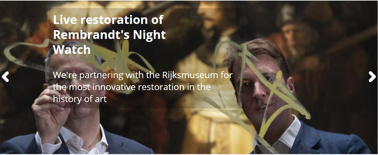
‘Operation Night Watch’: The ultimate alchemical partnership.
“There’s a natural link between us… We’re similarly driven by exploring new horizons and being inspired by the past while building for the future.”
Thierry Vanlancker – CEO, AkzoNobel
Recurring Themes of the Magician
Both projects weave together the same Magician threads: art (the symbol of imagination), national heritage, and the bridge between old and new built on innovation. AkzoNobel doesn’t just manufacture paint; they facilitate transformation. They provide the “how” that leaves people stunned by the “what.”

The Advantages of the Magician Archetype
Brands like AkzoNobel and GE have thrived for decades. When executed well, the Magician builds deep, loyal partnerships and a rock-solid foundation.
The Magician provides moments of joy and wonder that people crave. In this sense, it’s almost addictive—once customers experience your “magic,” they want to see what you’ll do next. By positioning yourself as the innovator with a revolutionary concept, you stay miles ahead of the competition. Your customers are looking for progress and enlightenment; if your brand provides the spark, you’ll earn their lifelong loyalty.
The Magician’s Pitfall
Promising a miracle is easy; delivering it is the hard part. The greatest risk for a Magician is failing to live up to the hype. If you over-promise and under-deliver, you give your competitors the perfect ammunition to dismantle your credibility. Subtlety is key: unless you are 100% certain you can deliver the miracle, keep your claims grounded in reality.

Related Archetypes: Hero and Outlaw
If the magic wand isn’t working, you might be a Hero or an Outlaw.
The Hero strives for excellence through mastery and skill. Like the Magician, they want to improve the world, but they are more focused on letting others excel. The Hero is happy to show the work; the Magician keeps it behind the curtain.
The Outlaw is the rebel who wants to dismantle the system to build something better. Both archetypes stand for radical change, but while the Outlaw is noisy, disruptive, and unapologetic, the Magician plays a more nuanced, subtle game of innovation.